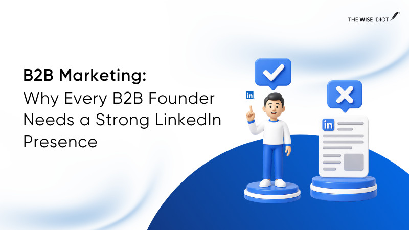
TLDR Summary
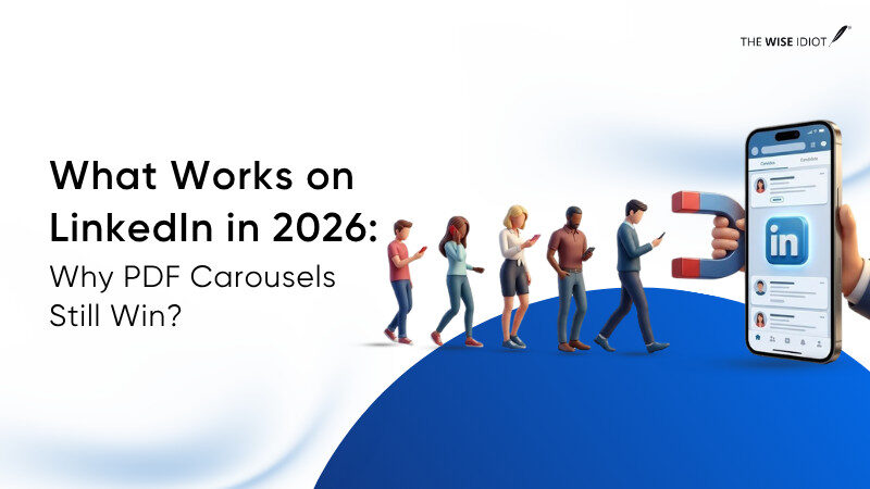
LinkedIn in 2026 rewards attention, and content that gets consumed (not just seen) is what scales. Linkedin PDF Carousels outperform all the other formats for organic reach because they increase dwell time, trigger multiple engagement signals, and keep users inside the platform.
This guide explains when and how to build LinkedIn PDF Carousels that get read.
Introduction
LinkedIn organic reach is down by approximately 50% year-over-year for the average user. Company pages now reach only 2–5% of their own followers on initial distribution. AuthoredUp’s analysis of 621,000+ posts found that 98% of creators saw a decline in reach in 2025.
But the drop isn’t equal across all formats.
While text posts fade, video reach declines, and link-heavy updates get buried, one format has held its position at the top: the LinkedIn PDF carousel, posted as a document post. This guide covers why and what to do about it.
What Post Format Works on LinkedIn Right Now
Socialinsider’s 2025 LinkedIn Benchmark Study – 1 million posts, 9,000 business pages and found this engagement hierarchy:
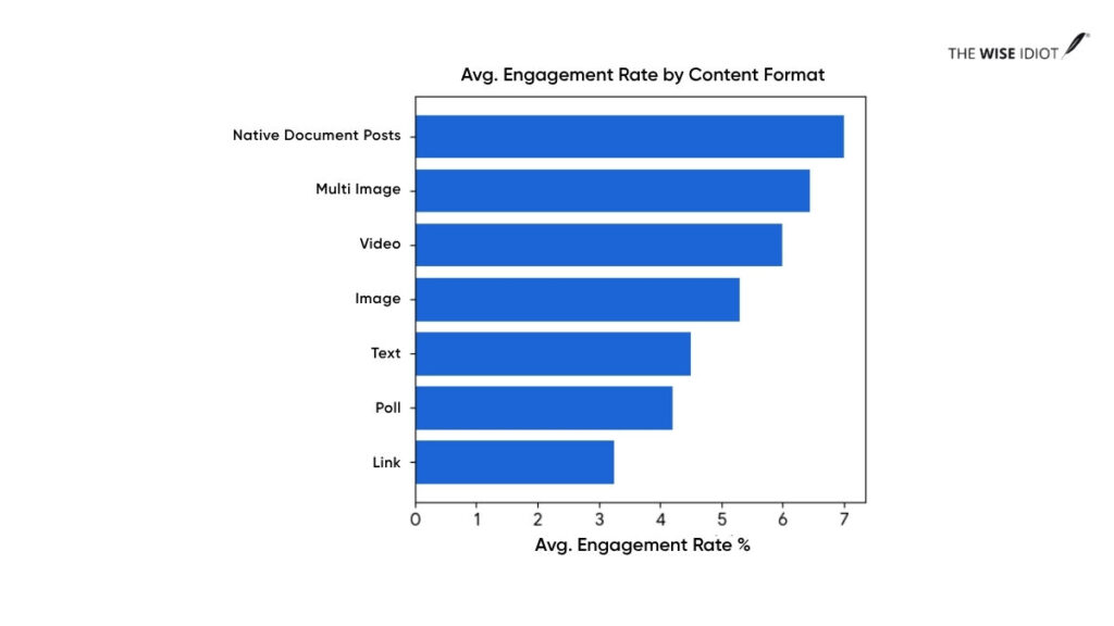
So, if you aren’t using PDF carousels (native document posts) in your LinkedIn content strategy, you’re essentially trying to sell a book by only showing people the back cover. LinkedIn PDF Carousels allow the reader to “open the book” without leaving their feed. LinkedIn content has also become quite significant in the AI-first search era.
In case you’re running out of ideas on what to post on LinkedIn, here’s a quick guide: Content ideas for LinkedIn
Why PDF Carousels Keep Outperforming
It’s all about the increased dwell time, a reader’s mindset as they swipe to view the next slide and LinkedIn’s native platform logic. Three reasons, each tied directly to how LinkedIn’s algorithm distributes content.
They Increase Dwell Time
Dwell time is the most important algorithmic signal LinkedIn measures. Every swipe through a carousel slide adds to the time a user spends on your post. The LinkedIn algorithm reads extended dwell time as a signal of quality and widens distribution.
LinkedIn PDF Carousels generate 30–60 seconds of average engagement per post, while text posts generate 3–5 seconds. That’s up to a 20x difference in sustained attention from the same audience.
They Create Micro-Commitments
When someone swipes to slide two, they’ve made a choice. Each subsequent slide gets easier to consume because the reader is already invested. By the final slide, they’re primed to act, which is why carousel CTAs convert at a higher rate than generic engagement prompts.
For instance, one B2B SaaS founder who switched from text posts to PDF carousels saw impressions go from 1,200 to 4,800, and engagement rate climb from 0.9% to 3.2%.
They Fit LinkedIn’s Native Platform Logic
LinkedIn’s algorithm wants users to stay on LinkedIn. PDF carousel posts are entirely self-contained. It has no external links, no redirect, and no reach penalty. They’re structurally aligned with what the platform rewards.
Saves and reposts are the two engagement signals LinkedIn weighted most heavily in its 2025 update and are natural responses to PDF carousel content. People save frameworks, checklists, and breakdowns they want to return to. One save drives 5x more reach than a like.
| A Reddit user documented exactly what happened when they switched from text-only posts to PDF Carousels. He got a 5-7x increase in reach from the same account, same audience, and he didn’t change the posting frequency either.
He says: “That’s roughly a 5-7x increase. Not because I’m special — because the LinkedIn algorithm pushes carousels harder.” |

When PDF Carousels Work Best
PDF Carousels outperform alternatives when the content genuinely benefits from structure, sequence, or visual separation.
Frameworks and How-To Content
Step-by-step content belongs in a carousel. Each step gets one slide, and the format mirrors the content’s sequence.
For example:
- “5-step onboarding system for SaaS users”
- “GTM framework for early-stage startups”
Each step becomes one slide, and this matches how users process information: Sequentially, not all at once
Data, Insights, and Industry Breakdowns
Reports are unreadable in text posts. The same analysis, distilled into a 9-slide carousel, one insight per slide, one bold data point as the visual anchor, becomes skimmable, saveable, shareable. The LinkedIn PDF carousel helps to distribute the long-form content.
Case Studies and Storytelling
The problem-solution arc maps directly onto the LinkedIn PDF carousel format.
Slide one: the hook that makes readers stop scrolling
Slide two: the problem.
Slides three to four: why it’s hard.
Slides five to seven: what changed.
Final slide: the result.
The unresolved tension of an unfolding story keeps readers swiping in a way a summary never does.
How to Build a PDF Carousel That Gets Read
Most carousels fail before slide two because of the structure. Here’s how you can build an engaging LinkedIn PDF Carousel.
Start With a Strong First Slide
Slide one does three jobs at once: headline, opening line, and thumbnail. It needs to name a problem the reader already feels, make a counterintuitive claim, or promise a specific outcome.
Weak: ‘5 LinkedIn Tips for 2026’
Strong: ‘Your LinkedIn reach isn’t broken. Your format is.’
If you showed only slide one to a stranger, would they swipe? If not, rework the hook first.
Keep One Idea Per Slide
One idea, one data point, and two to three lines of supporting text. That’s it. LinkedIn PDF carousels with one dominant idea per slide had meaningfully higher completion rates than those that tried to pack in more because density kills momentum.
Make Middle Slides Easy to Scan
Slides two through seven are where most LinkedIn PDF carousels lose readers. Build them for scanning, not reading. Use bold numbers or short claims as the visual anchor. Add a progress marker like: slide counter, arrow, threading element to signal forward momentum.
End With a Clear Action
The final slide is the conversion point of the entire carousel. Don’t waste it on ‘follow me for more.’ By the last slide, the reader has already demonstrated interest. Give them something specific: a template, a question, a relevant next step. Make the CTA feel like a natural continuation, not a pivot.
What We’ve Seen Work for a VC Firm
Working with a VC firm investing across the US and India, we saw engagement jump to 68%, more than 10x the platform average. This happened once we moved away from event announcements and text-heavy updates to structured PDF carousels.
Our carousels that performed best had three things in common: a hook with a real person’s face, anchor credibility with a quote, and a story that unfolded slide by slide.
The visual hook did the heavy lifting on slide one. A recognisable face stops the scroll faster than any headline. The quote gave the content credibility without the brand having to say “trust us.” And the slide-by-slide storytelling made sure people kept going because the next slide earned it.
That’s the formula. Hook → credibility → momentum.
And, the audience (founders, operators, and investors) read, saved, and came back.
Snapshot of a Case Study PDF Carousel
Best Practices Checklist for LinkedIn Carousels
This is a practical filter you need before publishing your LinkedIn PDF Carousel.
Content Checklist
- Slide one makes a specific claim or names a problem – not a topic title
- Every slide covers exactly one idea
- The carousel has a narrative arc: setup → insight → resolution
- Slide count is between 6 and 10
- The final slide has a specific, relevant CTA
- Post caption provides a hook, not just ‘new carousel out now’
Design Checklist
- Slides sized at 1080×1080px and optimised for mobile
- Maximum two fonts throughout the deck
- Brand colours consistent across all slides
- High contrast between text and background
- A progress indicator present on each slide
- No clickable hyperlinks embedded inside the PDF
- File exported as PDF, not PPT or DOCX for consistent cross-device rendering
Distribution Checklist
- No external link in the caption body, add in the first comment after publishing if needed
- 3–5 hashtags maximum
- Document title field filled in. This appears in the feed as a secondary headline
- Published Tuesday–Thursday, 8–10 AM in your target audience’s time zone
- Respond to comments within the first two hours; responses within 15 minutes generate a 90% algorithmic boost
Common Mistakes That Kill Reach on LinkedIn
- Opening with a title slide instead of a hook.
‘5 Ways to Improve Your LinkedIn Content Strategy’ is a title. It tells readers what the carousel is about, and it gives them no reason to care. A hook creates tension, while a title just describes.
- Too many slides covering too much.
A 20-slide carousel that covers everything will be swiped through by almost nobody. A 7-slide carousel covering one thing well gets saved by hundreds. Cut before you post.
- Putting the link inside the caption.
External links in the caption body trigger up to a 60% reach penalty. Publish without the link first. Let it gather engagement for 30–60 minutes. Then add the link in the first comment.
- Inconsistent visual design.
Different fonts, different spacing, different colour logic across slides signal low production value and undermine the credibility the content is trying to build.
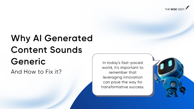
- Using generic AI-generated copy.
Brixon Group’s data from 500+ B2B profiles found that AI-generated content receives 47% less organic reach than content with a genuine perspective. Use AI to assist structure, but don’t let it replace the original thinking that makes content worth saving.
The Bottom Line
LinkedIn’s algorithm changed, and PDF carousels sit at the intersection of everything the 2026 algorithm rewards: dwell time, native format delivery, save-first engagement, and structured content that earns return visits. Every competing format has a structural disadvantage by comparison.
This format is free, the production cost is lower than video, and the LinkedIn organic reach advantage over text posts is documented and consistent. So, the question is whether your next LinkedIn PDF carousel gives people a real reason to swipe.
Frequently Asked Questions
What is the best post format for LinkedIn growth in 2026?
LinkedIn PDF carousels (document posts) are the top-performing organic format, achieving 6.60% average engagement – the highest of any content type.
Does LinkedIn penalise me for using Canva templates?
No. LinkedIn’s algorithm evaluates content signals like dwell time, saves, comments, and not the design tool. The risk with popular templates is that identical-looking carousels don’t hold attention. Customise to your brand and the problem disappears.
How many slides should a LinkedIn carousel have?
6–10 slides is the optimal range. Fewer than six often feels too thin to deliver value. More than 10 risks drop off before the CTA. If the content genuinely needs more, break it into a two-part series.
Is LinkedIn video better than carousels for organic reach?
Not in 2026. Postiv AI’s analysis of 2 million+ posts found video reach declined significantly last year as LinkedIn deprioritised the format. Carousels consistently outperform video on reach, engagement rate, and saves for most B2B accounts.
How do I create a PDF carousel for LinkedIn?
Design slides at 1080×1080px in Canva, Figma, or Adobe. Export as a single PDF. On LinkedIn, click ‘Add a document,’ upload the PDF, and fill in the document title field. Each page becomes a swipeable slide. Don’t embed hyperlinks in the PDF; put any URLs in the post caption or the first comment.